Mean Reversion: The “Gravity” Behind Bitcoin’s Price

“The market is growing up. And the math proves it.”


Introduction

Most Bitcoin models rest on a simple observation: price, on a logarithmic scale, grows roughly linearly over time. That’s the famous Power Law. And it works, as a starting point.

But there’s a problem. A model that only draws a line (or a curve) on a chart tells you where the price should be on average but it tells you nothing about what happens when price deviates from it. It doesn’t tell you whether it will come back, with what force, or how long it will take.

This article introduces a different framework without replacing the Power Law: it uses it as a foundation and builds on top of it a physical process called Ornstein-Uhlenbeck (OU), which describes exactly that return mechanism. The result is a model that not only estimates “fair value”, but quantifies the gravitational force pulling price back to equilibrium and, most importantly, measures how that force is changing over time.

This post is meant as a companion to the latest updates on the model page: Beyond the Power Law: A Two-Phase Model for Bitcoin Cycle Bottoms. If you haven’t read that yet, start there for the full context on the two-phase fair value model and cycle projections. What follows here focuses specifically on the mean reversion dynamics layered on top of that structure.

BTC OU Master Model


The Ornstein-Uhlenbeck Process, Explained Simply

Imagine a ball attached to a rubber band. The band is fixed to a central point (the equilibrium mean). If you pull the ball away from the center and let go, the band pulls it back. The further you pull it the stronger the return force and once the ball returns to center, it doesn’t stop perfectly: it oscillates back and forth, with the amplitude decreasing over time.

This is exactly the dynamics of the OU process, captured in one formula:

dX = θ(μ − X) dt

Where:

X is the current position of price (in relative terms within the channel between fair value and peak envelope).

μ (mu) is the equilibrium point, the center of the rubber band. In the model, this is the Yellow Line.

θ (theta) is the stiffness of the rubber band. The higher theta is, the faster price gets pulled back to center. The lower it is, the more freely price can wander.

The term (μ − X) is the distance from center. If price is above μ, this term is negative and pulls price down. If it’s below, it’s positive and pulls it up. The force always points toward center, in both directions, with equal intensity. This is the symmetry of the OU process.


The Two Gravitational Forces

This is the core insight of the model. Bitcoin’s price is not subject to one force, but two, and they have completely different natures.

First gravity: Theta (symmetric)

This is the rubber band force just described. It operates in both directions with equal intensity. When price is above the Yellow Line (OU Mean) theta pulls it down and when it’s below, theta pulls it up, theta has no directional preference: it’s a pure centering force.

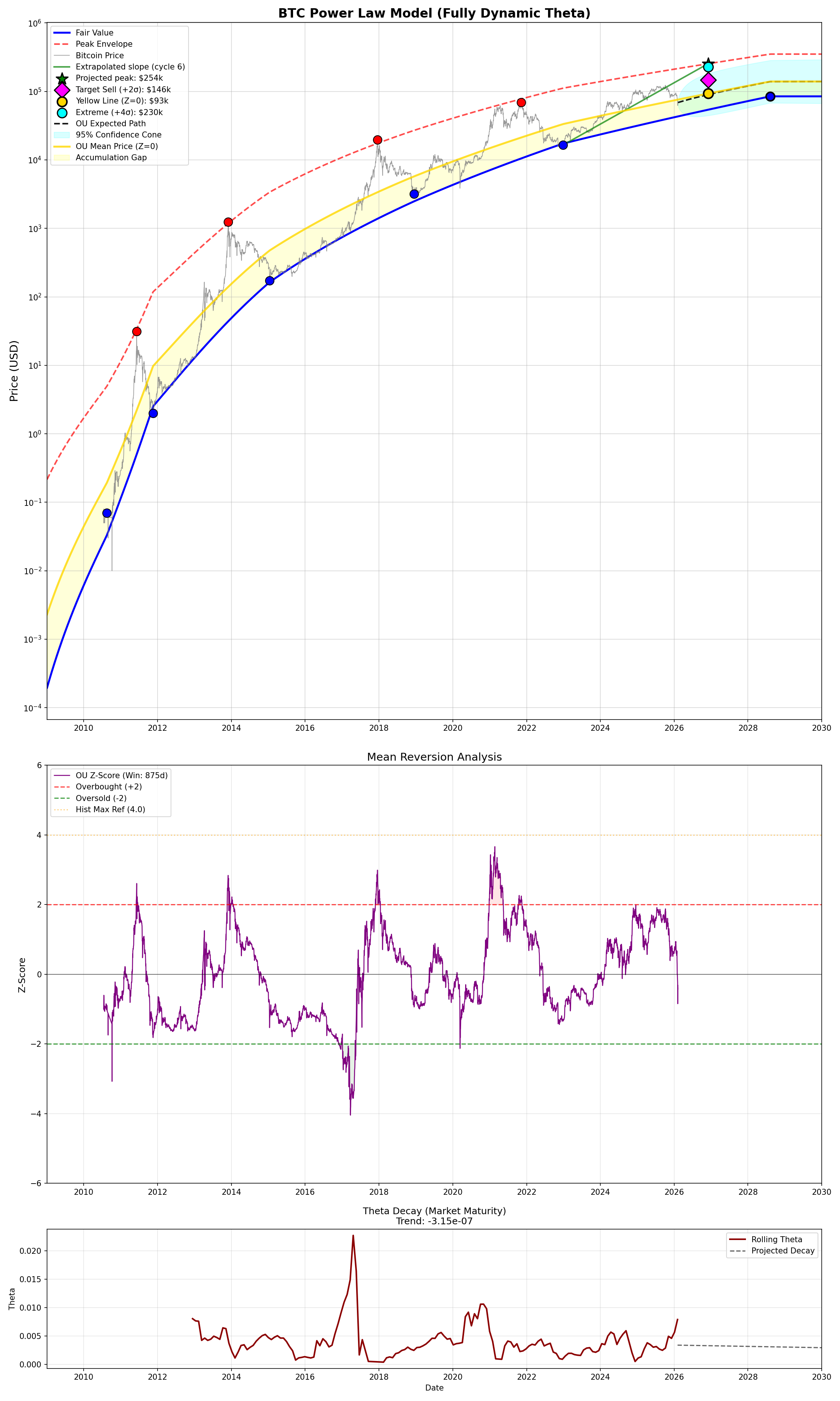
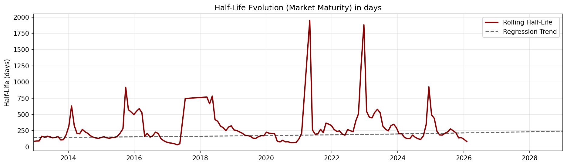
In the current model, the historical average theta is 0.00279, corresponding to a half-life of about 248 days (more on this below). The most recent rolling theta is significantly higher at 0.00831, indicating the current market is correcting faster than the historical average.

Second gravity: The Fair Value Floor (asymmetric)

The blue line on the chart is the Fair Value, computed from the two-phase Power Law. This line rises continuously over time and acts as a structural floor. It is not a symmetric force: it only acts from below. Price can rise as far as it wants above the Yellow Line (though theta will slow it down), but it can hardly stay below Fair Value for sustained periods.

The interaction between the two forces

The combined effect creates an asymmetric dynamic even though theta itself is symmetric. Here’s why:

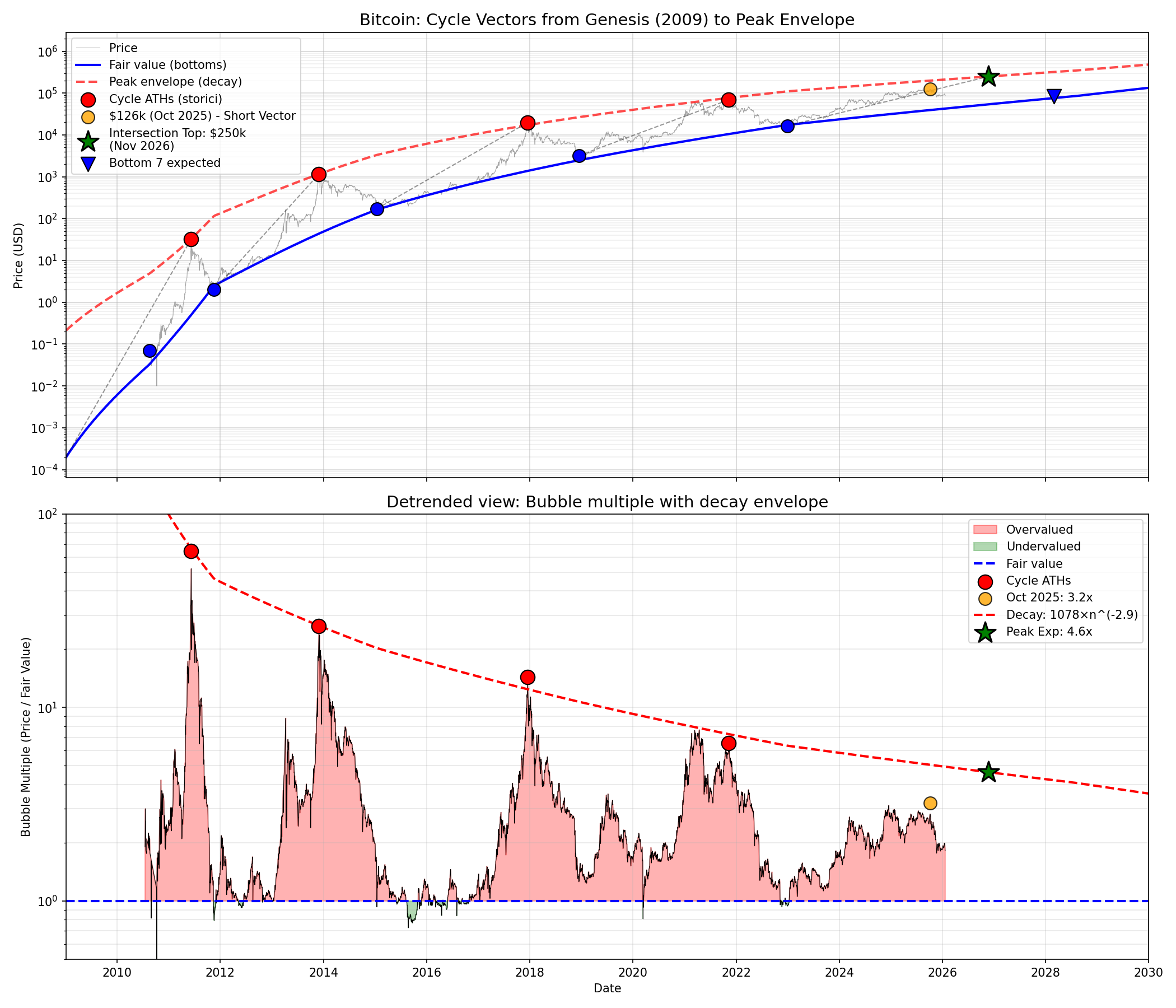
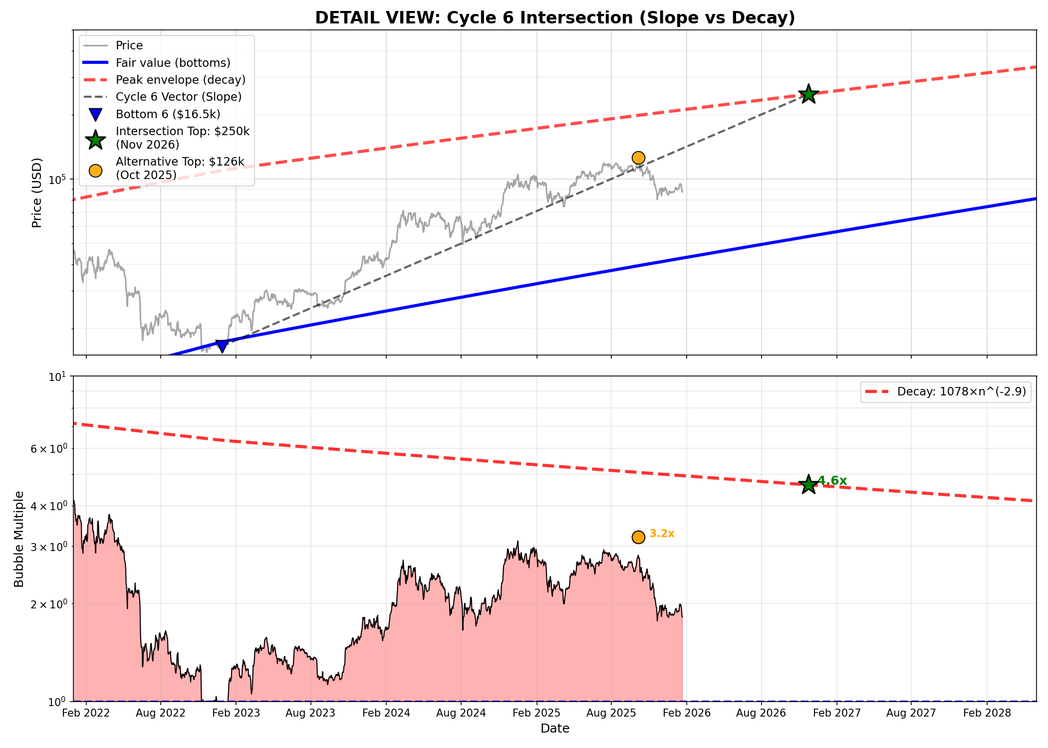
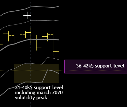
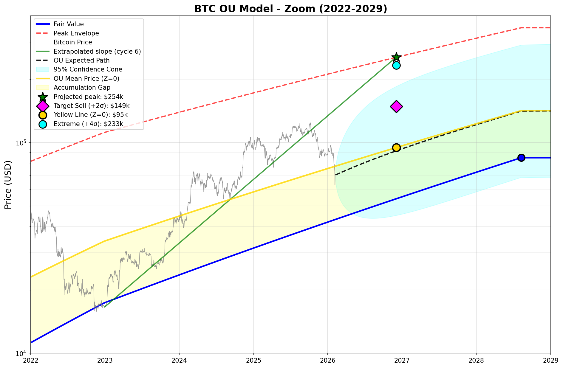
The Yellow Line (μ) sits structurally above Fair Value. In the model, μ = 0.3621, meaning the OU equilibrium point sits at 36% of the logarithmic channel between Fair Value and Peak Envelope. Not at the midpoint, not at the bottom: shifted upward relative to the floor.

This creates a crucial zone on the chart, the Accumulation Gap (yellow area): the space between the blue Fair Value and the Yellow Line. In this zone, both gravitational forces work in the same direction: theta pulls up (toward the yellow) and the floor prevents further descent (toward the blue). This is where price finds the strongest support.

Above the Yellow Line, only theta acts (pulling down). Below Fair Value, price is in “impossible” territory for prolonged periods, as the market’s very structure pushes recovery.

BTC OU Model - Zoom 2022-2030


Half-Life: How Long It Takes to “Come Back”

Half-life is the most counterintuitive concept in the model, but also the most useful for trading. Let’s break it down.

What it means

Half-life is the time it takes for the distance between price and the Yellow Line to halve. It’s not the time to return to the mean. It’s the time to cover half the distance.

Concrete example: suppose price is $40,000 above the Yellow Line. With a half-life of 248 days (the model’s historical average), after about 8 months price will still be $20,000 above the mean. After another 8 months, $10,000 above. And so on. Each period halves the remaining distance, but never fully eliminates it.

Why it works this way

It’s the exponential nature of the process. The return force is proportional to the distance: when you’re far away the force is strong and the return is fast, as you get closer the force weakens and the return slows down. It’s exactly like the rubber band: the first centimeters snap back quickly, the last ones are painfully slow.

Mathematically: t½ = ln(2) / θ ≈ 0.693 / θ

What it tells us today

The model produces two half-life readings:

Historical half-life (global average): 248 days (~8.3 months). This is the average correction speed observed across Bitcoin’s entire history. It includes the wild cycles of 2011-2013 and the more orderly post-2015 ones.

Current rolling half-life: 83 days (~2.8 months). The current market is correcting almost three times faster than the historical average. Rolling theta is 0.00831, equal to 297% of the average. This indicates a market where deviations from the mean get absorbed rapidly: less prolonged euphoria, less prolonged depression.

Trading implication

A short half-life means opportunity windows are shorter. If price hits an extreme (e.g. Z-Score +2 or -2), you don’t have months to decide, the mean reversion process is already underway, and the half-life tells you how quickly the window is closing.


Rolling Theta and Market Maturity

The third panel of the chart shows theta’s evolution over time, computed on rolling windows of 875 days (~2.4 years). The trend line (dashed black) has a negative slope: -3.42 × 10⁻⁷ per day.

What does this mean in practice? Theta is slowly declining. The market is becoming less reactive over the long run. Future corrections will, on average, be slower. The structural half-life will lengthen.

This is the mathematical signature of Bitcoin’s maturation as an asset class. A young, speculative market has high theta: prices explode and crash rapidly. A mature market has low theta: movements are more gradual, cycles are smoother.

The model uses this trend to project theta into the future: from 0.00321 today to 0.00272 by 2030. This dynamic directly feeds the confidence cone in the main chart: the cone widens over time not because of generic uncertainty, but because the gravitational force keeping price near the mean is getting weaker.

Half-Life Evolution Note: the trend line slopes upward because half-life is the inverse of theta. As theta decays (market maturing), the time to mean-revert increases.


Z-Score and Trading Targets

The middle panel of the chart shows the Z-Score, which measures how many standard deviations price is from the Yellow Line. The optimal window (875 days) was calibrated to produce a historical maximum of Z ≈ 4.0, corresponding to the extreme peaks of past bubbles.

Current status (February 7, 2026)

Metric Value
BTC Price $70,154
Fair Value $43,157
Yellow Line (Z=0) $77,296
Current Z-Score -0.41

Price is slightly below the Yellow Line, in neutral territory with a mild undervaluation. It sits within the Accumulation Gap, the zone where both gravitational forces support price.

Current trading targets (February 7, 2026)

Level Price Meaning
Target Sell (+2σ) $123,539 Distribution zone. Where you can start thinking to scale down your position.
Yellow Line (Z=0) $77,296 Equilibrium. The center of gravity.
Target Buy (-2σ) $48,363 Aggressive accumulation zone.
Panic (-3σ) $38,255 Rare event. Extreme buying opportunity.

Targets at projected peak (December 2026)

Level Price
Extreme (+4σ) $233,067
Target 1st Sell (+2σ) $148,523
Yellow Line (Z=0) $94,647
Peak Envelope $253,818

The projected peak at ~$250k represents the theoretical maximum where the cycle 6 slope intersects the decay envelope. But reaching the envelope requires a +4σ event, which has become increasingly rare as the market matures. The Z-Score at +2 sigma ($148k) is the rational distribution signal: it captures most of the upside without betting on an extreme that theta decay is actively working against.


OU Projection and Confidence Cone

The Expected Path (dashed black line on the chart) is not a price prediction. It’s the path price would follow if driven only by mean reversion, with no external shocks. It shows where gravity wants to take price.

The Confidence Cone (cyan area) represents the 95% interval of possible trajectories. It widens over time for two reasons: accumulated uncertainty and, most importantly, the progressive decay of theta which weakens the centering force.

In the short term (2026), the cone is relatively tight because theta keeps oscillations contained. In the long term (2028-2029), the cone opens as variance accumulates over time, which is a standard property of the OU process. Theta decay contributes marginally to this widening, as the decline rate is very slow (about 15% over four years), but the cumulative effect over long horizons is visible.


Conclusion: The New Normal

The model tells a coherent story. Bitcoin is transitioning from speculative asset to institutional asset. The math confirms it through three converging signals:

Theta decreases over time, meaning corrections slow down and cycles smooth out. Half-life lengthens, opportunity windows become more predictable but also shorter in relative terms. Fair value rises continuously and the Yellow Line with it, progressively raising the structural floor.

Pure speculation, the “buy at X and wait for 100X” kind, is mathematically in decline. The market will still move in cycles, but the multiples will compress and oscillations will be contained by an ever-present gravity.

For the trader, the message is clear: the $254k projected peak remains the theoretical cycle top where slope meets decay envelope. But the OU model adds a layer of risk management on top of that projection. Z-Score at +2 sigma ($148k) is the level where a disciplined, partial distribution makes sense. If price pushes to +4σ and hits the envelope, great. But sizing your entire exit strategy on a single extreme target is a bet against mean reversion. The model suggests scaling out, not going all-in on one number.


Data as of February 7, 2026. Model: BTC Power Law + Ornstein-Uhlenbeck with dynamic theta. Full code available on request.

Quantify the Euphoria: Top Model and the forecast to $250k

If the “Two-Phase Power Law” model defines the floor (Fair Value), a complementary equation defines the ceiling: the Peak Envelope.

To understand where price may go in this cycle, we must analyze two opposing dynamics that evolve over time:

  1. The deceleration of the rise (Slope Decay).
  2. The contraction of the bubble (Peak Envelope Decay).

1. The Mathematics of the Rise (Slope Decay)

One of the main flaws of fixed 4-year models is the assumption that every cycle is identical in time. The data show the exact opposite and the speed at which price rises from bottom to top is decreasing according to an inverse power law.

By analyzing past cycles, we obtain the following formula for the slope (rate of ascent in logarithmic terms):

Slope = 14.68 × n^(-2.17) decades/year

Where n is the cycle number.

CycleLength (days)True Slope (Dec/Year)Slope Model
22953.2913.267
37421.3581.356
410680.7040.727
510610.4590.448
6?~0.21 so far0.302

What does this mean? In 2013 (Cycle 3), the market was rising at a crazy speed (1.35 decades per year). For Cycle 6, the model predicts a slope of 0.302.

It is like saying: “The Ferrari has turned into a freight train. It is still powerful, but it takes much longer to reach its destination.”.

The “Slope” (velocity) in this model tells us how many powers of 10 the price rises by every year:

Slope 3.0 = Price multiplies by 1,000 every year.

Slope 1.0 = Price multiplies by 10 every year.

Slope 0.3 = Price doubles every year.

2. The Peak Envelope

While price rises more slowly, the bubble multiple (how far above Fair Value we are willing to pay) is collapsing.

  • In 2013 we paid 25× Fair Value.
  • In 2021 we paid about 7× Fair Value.
  • In this cycle the ceiling (Envelope) will fall even further to an expected value of 4.7x

We modeled this decay using an inverse logarithmic curve that connects historical peaks.

3. The ‘Self-Consistent’ Projection at ~$250k

Instead of guessing a date, I wrote an iterative algorithm (in Python) that searches for the geometric intersection between two forces:

  1. The Upward thrust: the line starting from the bottom ($16,500) with the Cycle 6 slope (0.302).
  2. The Ceiling: the Peak Envelope curve declining over time.

The point where these two lines collide is the cycle top. (check below images)

Model Result (Baseline):

  • Peak date window: from November 2026 to April 2027.
  • Price: ~$250,000
  • Multiple: about 4.7× above Fair Value at that time

This scenario represents historical continuity. A longer cycle than previous ones, extending beyond the usual 4-year pattern, allowing price to grow until the bubble multiplier stops it.

A November 2026 top may be optimistic, the date can shift to April 2027 due to slope uncertainty.

=== FIT ===
slope = 14.6835 × n^(-2.17) decades/year
Std residuals: 0.0242 decades/year

=== SLOPE Cycle 6 ===
Forecasted value: 0.302 decades/year
Error (1σ): ±0.024 decades/year
+1σ: 0.326 decades/year
-1σ: 0.278 decades/year

ScenarioSlope dec/year Top DateTop PriceBottom DateBottom Price
-1σ0.2782027-03-31$ ~250,0002029-01-24$84,770
Mid0.3022026-11-27$ ~250,0002028-07-31 $83,800
+1σ0.3262026-08-13$ ~250,0002028-03-02$76,000

4. Alternative Scenario: The ‘Short Top’ at $126k

The model is sensitive to volatility compression. If the peak envelope decays faster than the historical average, the intersection happens much earlier.

In this contraction scenario the top has already been done:

  • Peak date: 6 October 2025
  • Price: $126,000
  • Implication: the market would have become efficient too early. Bitcoin would behave like a mature asset, with short cycles and low multiples, eliminating extreme euphoria phases.

If the last October top at $126,000 is confirmed as top of cycle 7 then it’s very easy to compute date and price of the bottom, $54,000 by December 2026 (fair price of my 2 phases price model) resulting in a perfect 4 year cycle, 4 years between November 2022 bottom and December 2026.

Conclusion

The model establishes $250,000 by late 2026 (with a potential extension into early 2027) as the natural geometric output”. In this baseline scenario the cycle’s ascent perfectly intersects the historical ‘Peak Envelope,’ maintaining the balance between price momentum and the decay of bubble multiples.

Conversely, a peak at $126,000 in October 2025 would not invalidate the model, but would signal accelerated market saturation. This ‘short top’ scenario implies that the market is no longer willing to pay the excessive premiums of the past.
It effectively suggests that Bitcoin’s valuation will be capped at approximately 2x its intrinsic Fair Value during each boom-bust cycle. Such a move would mark the definitive transition from a hyper-volatile speculative instrument to a mature, low-volatility asset.

Long Term Update: The Big Picture part II

BTCUSD Monthly Chart Jan 2021 to present day

For all my Italian followers, I am pleased to announce that my analysis are now available in Italian on bit-reminder.com. This Italian website, which I collaborate with, is a valuable resource for those interested in the cryptocurrency world, with lots of information and a technical analysis section authored by me. In addition to covering Bitcoin, from time to time I also discuss some altcoins using the same approach, utilizing the CRSI oscillator and KAMA price bands. You can find the Italian version of this article on that website as well.

Since I last made my prediction in February, Bitcoin has continued to rise and is now approaching the resistance level of $36,000. However, bitcoin is hesitating just below this critical level of $36,000 without a clear breakout. The modified RSI oscillator is approaching the overbought level, so probably we are two to three months from a top.

Based on the Kama average levels, my earlier prediction of a target range of at least $36,000 with a maximum potential upside of $58,000 still stands. However, given the current market conditions, it’s difficult to say whether we will see a new intermediate top this year. However, there is still a significant portion of May left, so it will be interesting to see how the market develops in the coming weeks and if there is enough fuel to approach $36,000 before end of June and possibly break it to hope to see $50,000 by the end of the year.

Short Term View

BTCUSD Daily Chart


For those who follow me on Twitter, they already know about the situation in the short term. Since the market’s corrected inversion on April 25th, it has been weak and moving sideways. There is a possibility that it might drop to $25900, which could result in my CRSI becoming oversold and recharging itself, potentially leading to a new short-term buy signal.

Long Term Update: The Big Picture

BTCUSD Monthly Chart with KAMA+Deviation Bands, RSIC oscillator confirming new buy signal

In the chart above, there is a new buy signal from a modified RSI oscillator after an apparent four-year interval, with a smoother output compared to the original. My yearly prediction, which I typically release in January, appears to be consistent with the Kama average levels. The estimated target range for this upward movement is at least around $36,000, with a maximum potential upside of $58,000. As a result, I believe that we will not see a new all time high during this year.

It can be noted that the examined oscillator also gave two bearish signals in 2017 and 2021, at the respective peaks of the four-year bitcoin cycle.

Does the 4-year halving cycle exist or not?

While many people believe in the 4-year cycle of Bitcoin, which is linked to the halving phenomenon, I personally think that this effect is not significant. The price of a commodity, including Bitcoin, is mainly determined by the supply-demand balance and the liquidity of the market, rather than by scarcity or safe-haven properties. Indeed, there are many scarce things in the world that have no value simply because there is no demand for them.

In my view, Bitcoin’s price is affected by liquidity cycles and the interest of investors in the asset for various reasons. When the liquidity provided by central banks decreases, Bitcoin’s price is likely to bottom out as well. However, it may take many years for Bitcoin to overcome the influence of central banks, given their significant impact on the global financial system.

In practice, if we measure it, the long term cycle we can find in Bitcoin is three years and a three months (on average), which surprisingly resembles the liquidity cycle in China observed in its 10-year bond yield, CN10Y.

10 Year Chinese bond and major Bitcoin tops

It is important to acknowledge that the Chinese 10-year bond yield can be influenced by central banks, including the People’s Bank of China. This is because bond yields reflect the expected return for investors who hold them until maturity, and interest rate changes can impact the bond’s value. Central banks have the power to adjust interest rates through various monetary policy tools, such as altering the money supply, setting interest rate targets, and buying or selling assets like bonds.

Therefore, movements in the Chinese 10-year bond yield can serve as an indicator of shifts in monetary policy, which may have a ripple effect on other asset classes, including Bitcoin. It’s worth noting that Bitcoin is known for its high volatility, and any changes in monetary policy could potentially affect its value as well in a dramatic way.

It’s important to keep in mind that the total market capitalization of Bitcoin is currently around half a trillion dollars, while the liquidity being moved by central banks is much larger, estimated at around 100 trillions dollars. The impact of monetary policy decisions by central banks on Bitcoin’s price may be significant at this point, given the relatively small size of the Bitcoin market compared to the global financial system. However, as the market value of all existing Bitcoins grows over time, it may become more resilient to external factors, including monetary policy decisions. Nonetheless, it’s likely that the influence of central banks on Bitcoin will continue for many years to come.

We can observe that in the current cycle, approximately 20 months have passed from the peak in 2021 to the recent bottom. Based on this, we can hypothesize that the current cycle may be 40 months long, which is in line with the previously calculated value of 39 months (3 years and 3 months).

I hope you enjoyed the article, and I would like to invite you to comment and share your opinion. You can comment here or on Twitter. If you are Italian, an italian version of this article is available at bit-reminder.com

Portfolio Update: Long 1 unit at 22451$

LONG TERM
1 unit bought at 22451$

SHORT TERM
No position open

As someone who is interested in long-term investments, I recently made the decision to buy bitcoin at a price of 22451$. I will explain the reasons that led me to make this decision.

The first reason is based on technical analysis. An oscillator indicator, which measures momentum, has recently given a bullish signal on the monthly chart of bitcoin. This is a strong signal indicating that the price of bitcoin is likely to continue rising in the coming months like it did in 2015 and 2019, this oscillator is a modified version of the classic RSI indicator.

The second reason is related to price action analysis. After testing the first resistance of the weekly chart, the price of bitcoin has retreated to the weekly moving average, which has provided strong support. This is a positive sign, and it suggests that the price of bitcoin is likely to continue its upward trend and should reach the $30,000 mark.

The third reason for my decision to invest in bitcoin is based on a longer-term trend analysis. It has been enough time since the top of 2021 to justify a period of consolidation, with a low point slightly above $15,000. This bottom is still quite high compared to the one of 2019, confirming that the overall trend of bitcoin is still strongly upward.

In conclusion, my decision to buy bitcoin at a price of 22451$ is based on a combination of technical analysis, price action analysis, and long-term trend analysis.

Stop loss is wide as usual for long term trades, support is the 2nd price band on weekly chart, if the price of Bitcoin falls below $14,000, I may need to reconsider my position and potentially exit the trade.

On the upside, the first significant resistance level is at $30,000. This means that if Bitcoin is able to break through this level, there could be significant upside potential for the trade, breaking through the $30,000 resistance level could potentially set Bitcoin up for a bullish trend towards the yearly forecasted resistance level of $58,000, which was predicted back in January in my yearly forecast.
More info in the upcoming updates.

Weekly BTCUSD Chart
Weekly Chart BTCUSD with KAMA average and price deviation bands, price is holding above the Kama average now at 21000$

Long Term Update: Will it work?

Since I published the annual forecast last January ’22, BTCUSD has already tested the lower limit of the forecast twice, at around $30,000.
I don’t know whether to interpret this behaviour as a sign of weakness or not. What is certain is that if the TOP of this halving cycle has been made it is very likely to test at least the 1st lower band of my monthly Kama average (22,700$).
Let’s see in detail the levels that I consider interesting to observe.

BTCUSD Monthly chart since 2017 Top

I would interpret as a signal of possible weakness a breach of the $29,800 level, certainly we need to consider how long bitcoin will remain below that level.
In times of temporary high volatility it would not be so serious a short permanence there; however a prolonged stay below this level would have long term bearish implications. What does this mean? It means that the games are over for this cycle and we will have to wait for the next halving of 2024, so I would say 2025, to see a new all-time high. This conclusion I guess doesn’t surprise you, by now the 4-year halving cycle of bitcoin is well known to the public.

The question is whether the price will stop at the first level of the Kama band or not. I think so, around $22,000 the support will be very strong and there will be buyers.
I exclude a severe test at the next support, around $14,000, also because bitcoin has never moved below the high of the previous halving cycle, in this case the last one was at around $19,800 in Dec. 2017; furthermore even during the corona crash the price stopped on the first lower band (at that time $3,800)
I wonder what needs to happen to see bitcoin test the second price band at $14k, if any of you have ideas please come forward 🙂

Personally, I will be a buyer again around the first support of the Kama average, around $22,000. Should an extreme level of volatility occur, I will increase the position at $14,000 with a doubled position size (1 unit at 22k$ and 2 units at 14k$) because i’ve to capitalize when volatility is at extreme levels without any fear.
See you at the next update.

Long Term Update: Will it work?

In the last update I had pointed out that it was crucial to exceed the monthly kama average (at that time around 40k usd), so bitcoin did and after a very strong bottom in July it resumed the uptrend on the monthly chart. Why a strong bottom? Because it was far above the support price zone defined by the lower bands.

At this point it is obvious that it will do a new top under the push of the ten-year old uptrend, after all bitcoin never entered a prolonged bear market since its inception.
For quite some time now, thanks to the price bands, I have identified the price zone where the next top will happen, that is between 80 and 130 thousand dollars. This is the minimum target IF, and I emphasise IF, the monthly average kama will remain flat.
If you look at the attached chart you will notice that the monthly kama average is no longer flat but is going upwards, albeit slightly.

BTCUSD Monthly Chart

This fact should be kept in mind because the greater the upward slope of the average the lower the possibility that the bitcoin will stop in the resistance zone, if an asset is trending strongly you should forget the price bands.
You may have noticed in the chart this aspect of the 19 months between the halving of the block and the market high, there are already two times that this market did a top within 19 months from the halving and in this cycle the expiry date is next December, the question then arises, will it work?

I think not, the market is never so symmetrical, we are talking about non-linear dynamics here that almost never lead to a strong symmetry or repetitiveness of price patterns, so I expect it to do something different this time and there are two possibilities, or that the maximum has already been done or that bitcoin will make another even beyond 19 months from halving, I am inclined to the latter possibility with the important implication that it might go above the price resistance zone.

How to translate this into your trading operativity? For the more risk averse you could evaluate a scaling down of the position at a point of your choice in the range 80k-130k usd. For all others you could use a dynamic stop loss like “chandelier exit” to try to exploit as much as possible the current uptrend. Search for “chandelier exit” or “chandelier stop” on tradingview, you will find many versions of this indicator.

Short Term Update: Still bearish

We are flat, usually it happens so the market finds a strong point (where the indicator of efficiency of kama average reaches values around 0.80-0.85) and stops, at that point it can go in lateral or bounce noticeably.
In most cases we enter in a lateral phase which is now defined by the usual bands that I use (see chart below).

BTCUSD – Daily Chart

What i’d like to see is:

  • Some consolidation above daily kama average, >38,000$
  • A first breakout of the first resistance band at 41,000$
  • A test of the 2nd band at 44,000$
  • Some healthy retracement back to 41,000$ or so
  • Final break-out above 44,000$

This could be a good recipe for a trend reversal on the daily chart.

38,500$ is not only the daily kama average but also the 2nd support band on the hourly chart, i’d like to see bitcoin above it these days during a possible accumulation before to break above 41,000$.

Fix in your head that as long as we stay below $44,000 (by the way it is also the monthly Kama average) my view remains bearish.

Long Term Update: Top is probably in for this cycle.

I think at this point it is very likely that the TOP of this cycle has been done and to see a next top we will have to wait the next cycle of 2024-2028 with a possible top expected in 2025.
One could say that Bitcoin could repeat what we saw in 2013 with two successive highs, one in March and the other in December but I think it is unlikely that history will always repeat itself with the same patterns.
I don’t think it is negative for bitcoin another 4 years of consolidation spent between the floor price and kama average as we have seen in previous cycles.

As you can see in the below monthly chart the new floor price zone is around 12k-20k usd, will bitcoin go there? I don’t know, honestly I think we can expect something different this time as the intermediate level of low volatility highlighted in the chart may work holding bitcoin above 28k usd.

BTCUSD – Monthly chart

First test is to see if this intermediate level will work or not, if not then a capitulation might occur around 20k usd that it was also the top (static support now) of the previous cycle (December 2017).

My doubts also include the fact that I was expecting a much stronger top than this one done at around 64000 dollars, if confirmed it would be a weak top for this cycle and I would interpret this as a slowdown of the long term trend; this is also understandable, as an asset grows in size it also becomes slower and more stable with lower and lower volatility and less and less intense bubbles.

For the current trade the trailing profit at $29k remains unchanged, if caught I think I will buy back again if support at 28k will holds in the coming weeks and/or months and eventually i’ll buy again inside the floor price of this cycle.

Crash Update: How many Periods to use?

I’m writing this update to do a clarification to the analysis posted the other day, as I had said the support range of the price bands that I use had contracted a bit giving me an area of support of 36-42 thousand dollars, why this? Because I use 60 periods to calculate volatility and more than 60 periods or weeks have passed since the minimum of March 2020 where there was a correction similar to this one, therefore the volatility peak recorded in that bottom of last year is no longer included in the calculation.

Hence the question “How many period to use?” is legitimate, in some cases is smart to fine tune the indicator parameters to better accommodate what is happening (an increase of volatility).

For those who use my indicator with tradingview can verify what i’m saying by themselves by increasing the setting “rms periods” from 60 to 70 for example.

Having said that, the support zone is thus corrected to around 31-40 thousand dollars and I would say that for now it has worked quite well, this means that we are still in the limits and that a trend reversal on the weekly chart is not yet confirmed, so far we are just seeing volatility at work.

We will have to wait until the end of this week and next week to better evaluate the ongoing correction to check if bitcoin price will remain above 31000$ or not.

BTCUSD Weekly Chart

Long Term Update: No more Tesla.

“…..on the daily chart where there is strong support but again it is a question of which timeframe will prevail and at the moment I would bet on the weekly chart, nonetheless there might be a minor rebounce from here….”

Last Update April 23, ’21

The minor rebound happened, market remained sideways around the daily average and came back down because of an accident (a tesla went off the road)
Let’s broaden the view with a weekly chart.

BTCUSD Weekly Chart – Below Kama Efficiency Ratio

Everything that has been happening since February 2021 which is the the slowdown of the trend on the weekly chart was expected and is the result of a careful observation of the volatility / trend ratio, two elements that characterize the average that I use (Kama)
I expect a further slowdown of the trend until mid-June when Bitcoin will be completely flat, from there on a new trend will emerge on the weekly chart; the future of bitcoin will be decided there should this new incoming trend be positive or negative (i guess positive).
A good idea could be to buy in the next week if bitcoin will test the weekly support zone in the 36,000-42,000 $ price zone, this market is lateral therefore I expect that it will not fall under 36000 dollars.

I think in July, I hypothesize, some liquidity may return to bitcoin from altcoins, also because the bitcoin market share chart (BTC.D on tradingview) has a nice spike in the kama efficiency ratio on the weekly chart (bottom might be near).
If a new trend is expected on the weekly chart for July let’s say, who could fuel this new trend? A return of liquidity from altcoins to bitcoin itself.

As usual if you have any doubts leave a comment, it is well appreciated.