“Cacoethes scribendi” or translated from Latin to english “a burning desire to write”, writing always of bitcoin sometimes is boring, today i show you the template i use with metatrader 4 applied to other assets like stocks, indexes and altcoin.
I already explained that an idea that i like is to do a price regression of our asset using a filter that eliminates all cycles below 30-40 periods with the intent to extract the underlying long term trend, then you can try to earn some money trading the secondary cycles that move the price up and down inside the price channel.
SP500/N100 weekly chart

Mid channel line color is white thus this market is neutral the ideal situation to trade the price levels, at the moment there could be a short opportunity, stoploss above the dotted positive deviation line.

Similar situation for the nasdaq 100 index.
GBPUSD
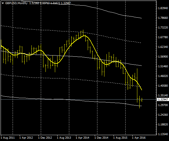
The big drop of the Brexit is clearly visible, the pound should stay above 1.29, it’s the moment to buy with a stoploss below 1.28
Nikkei 225
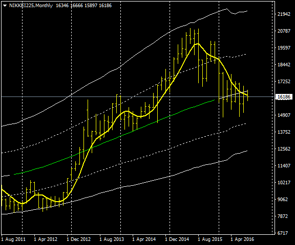
Nikkei is short for Japan’s Nikkei 225 Stock Average, it is a price-weighted index comprised of Japan’s top 225 blue-chip companies traded on the Tokyo Stock Exchange. The Nikkei is equivalent to the Dow Jones Industrial Average Index in the United States.
In this mothky chart is visibile the big rise fueled by the quantitative easing of the Japan Central Bank and the subsequent drop after flirting with the resistance at 21000.
At the moment it is holding above the first negative deviation line, i don’t see any trading opportunity.
Tesla
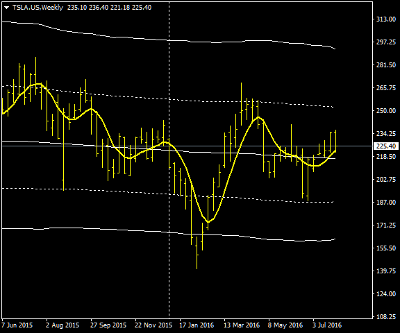
On the weekly chart the tendency is neutral, midline color is white, ideal to trade secondary cycles like the one that pushed down Tesla below 150 usd and below our support, a very good trading opportunity, it is possible also to trade the dotted levels but they are less safe.
Ferrari

Daily chart of ferrari (RACE ticker), after an interesting double bottom on the support this stock trended higher above the resistance after the earnings.
I think we are seeing a buying climax and in this situations is smart to sell the good news, i see a short trade opportunity here but it’s wise to wait some weak signals from this stock before going on.
Nintendo and the Pokemon Go Bubble

No comment here, the bubble is evident but this stock is still hovering above midline and the long term trend is bullish. Again a nice double bottom at the support.
Apple
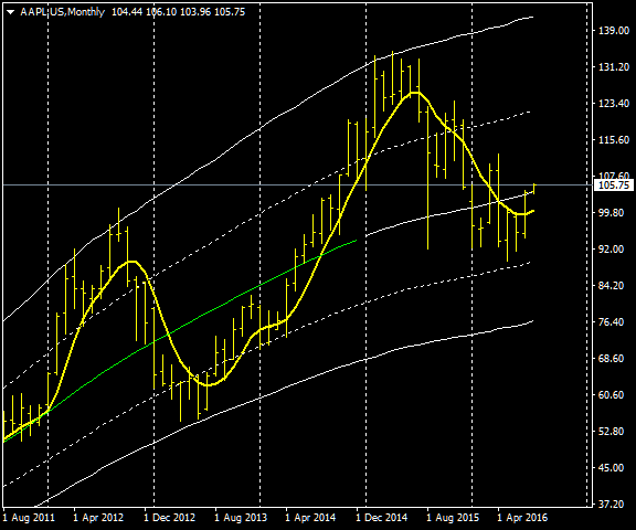
Last five years of Apple in this monthly chart, here the support levels worked almost perfectly. Apple is losing some steam as the midline color is white, neutral long term tendency despite you can see a sequence of higher highs and lows. The stock reacted from the dotted line at around 90 usd but i’m not sure is going up yet, the trading opportunity here is a test at 75-80 usd this year or the next one.
ETCUSD – Hourly chart
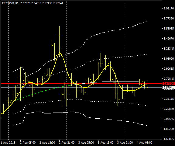
Hourly chart of ethereum classic, again bubbles are clearly visible. Some congestion outside the upper solid deviation line it’s the warning signal, be prepared to open a short. Now volatility is a bit lower and this altcoin is moving inside the dotted deviation lines. I see a buying opportunity once 1.85 usd is tested.
Conclusions
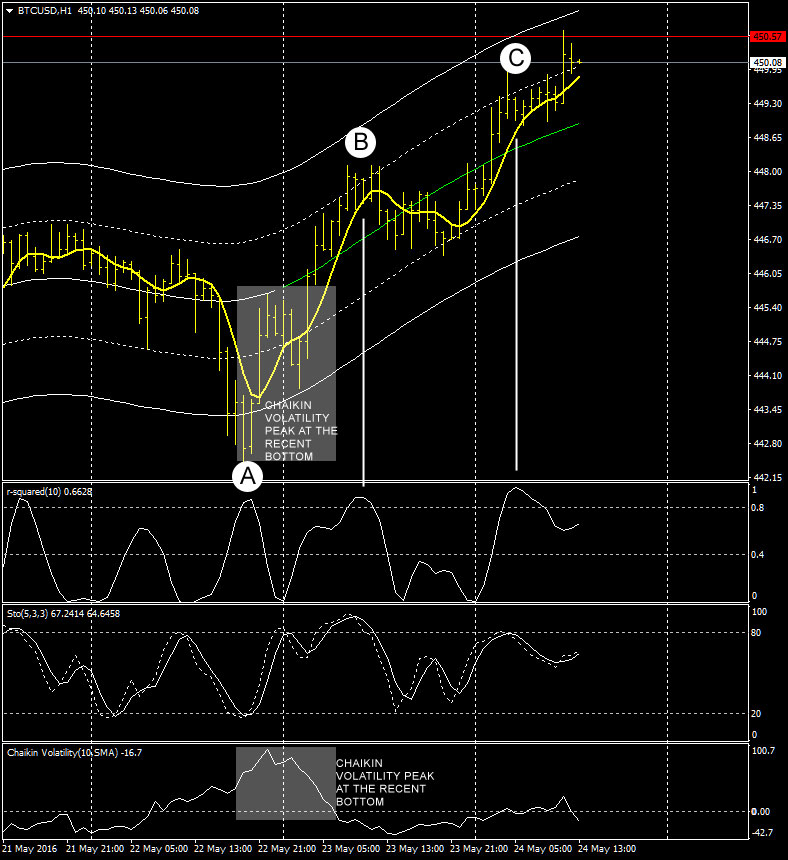
This price channel indicator is an improvement of the classic bollinger bands indicator, what i don’t like of the bollinger bands is the wrong way to compute the upper and lower bands that might lead to very misleading values sometimes as i explained at the end of this old article. To keep things simple i omitted to include some timing indicators, for example adding the Walter Bressert DSS oscillator with ethereum classic we have:

Clean cycles togheter with a correct approach to spot support/resistance levels and you have a decent guide to follow. This oscillator is configured using 9 periods and 5 periods for a second pass smoothing.